John Deere apple watch app

A troubleshooting app on Apple Watch for JohnDeere customers who are baby boomers.

My Role

Responsible for user research, product strategies, UI mockups, prototyping and usability testing

Tools & Methods

  • Sketch, Invision
  • Contextual Inquiries, Competitive Analysis, Personas, Mockups, Prototyping, Usability testing
  • Goal

    Identify a pain point and design an Apple Watch app to solve it for John Deere baby boomer users.

    Overview

    This is a project for my HCI class at Carnegie Mellon. The scope and constraints (e.g. apple watch as the device, baby boomers as target users and John Deere as the brand) are given in class.

    Design Process

    Phase 1. Understand pain points and define target users

    We started the project by identifying the key tasks in the ideation phase.

    Then we interviewed with target customers at places like HomeDepot and Lowes and dealers at local John Deere offices to learn about what pain points most customers experience, how they solve them, and John Deere's role in the process.

    Based on our data, we crafted 3 personas and chose Persona 3 Small Medium Business owners as our target users because they're more likely to be able to afford an Apple Watch and manage their machines more frequently. Based on the needs for the target persona and feedback from user research, we came up with 3 features for the app - Overview, Troubleshooting and Performance .

    Phase 2. First Design Iteration

    The mockups below demonstrated the Overview of machines, Performance and Troubleshooting features for the first version of the apple watch app. We also created 3 versions of notifications to compare, and we chose the transparent one.

    During the design review in class, we identified the following issues for further improvements -

  • There are too many colors in the app and there were inconsistencies in the color patterns.
  • It's too text heavy , which doesn't align with the purpose of the apple watch.
  • It felt like the app is missing a landing page that helps users navigate.
  • Phase 3. Second Design Iteration

    In this iteration, our goal was to modify the issues we identified and use the current prototype to conduct usability testing with target users.

    UI Design

  • We created a menu as the landing page to help users better understand how to navigate.
  • We reduced the amount of text and used icons for some of the explanations in the app.
  • Created a new manual section for users to look up whenever they need since we added more icons
  • Usability Testing

    We created a test plan and conducted usability testing with 7-10 users including both business and individual owners, and here's what we found -

    After the second design iteration, we realized we did not validate our product features early enough, and we should go back to rethink about what we should build that will solve problems for John Deere baby boomer users.

    Phase 4. Last Design Iteration - Rapid Prototyping

    After the second design iteration, we realized we had to redefine our target users and iterate faster on our prototype in order to deliver on time.

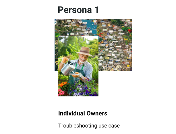
    Based on the limit amount of time we had, we decided to go back to individual owners, who have a simpler issue with the product - troubleshooting.

    During the last two weeks of the project, we created 3 rapid prototypes and ran testing with 5-7 target users to help us improve the product -

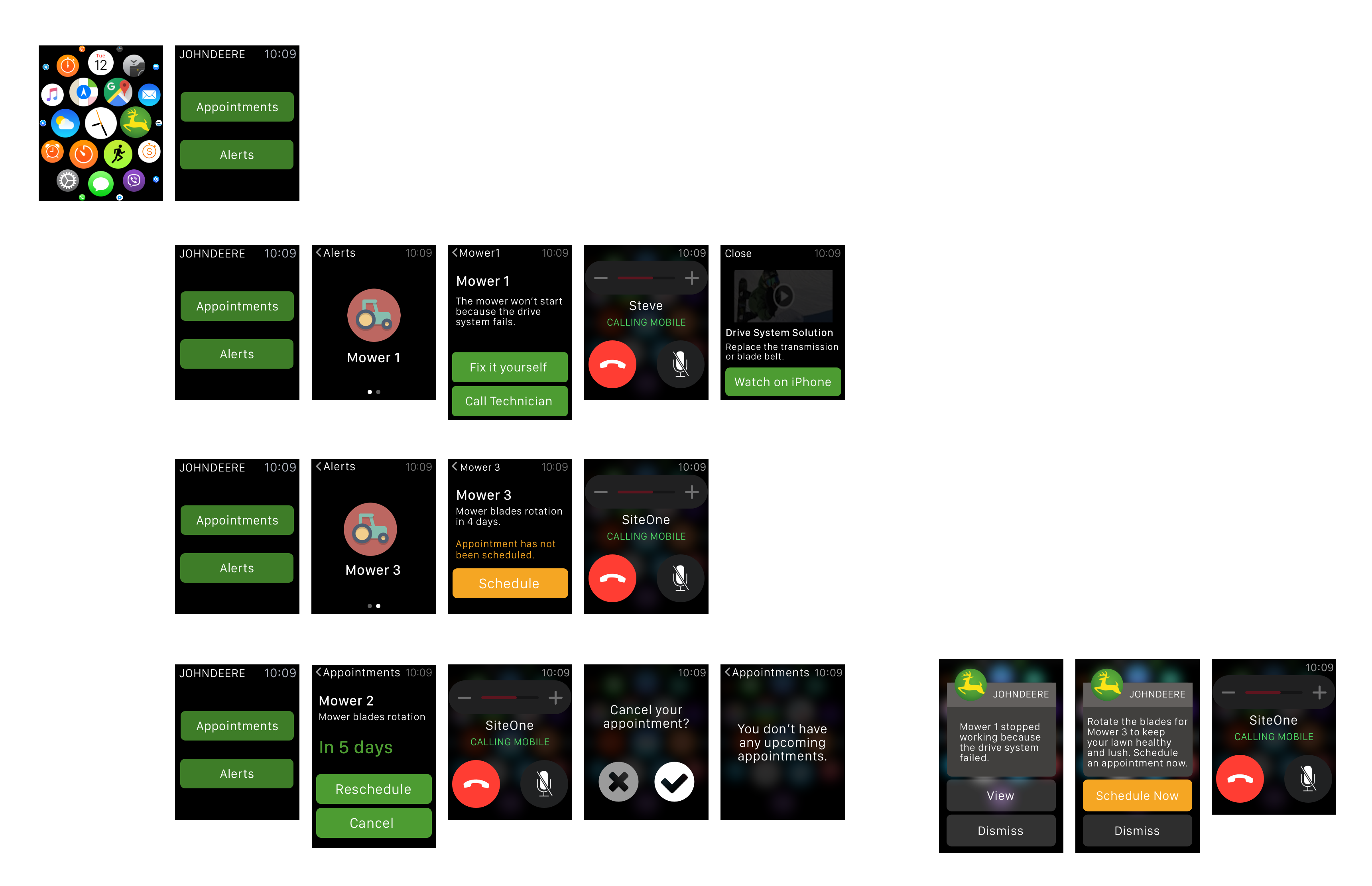
  • Provided 2 options for troubleshooting based on users' feedback - Fix it yourself or Call Technician to schedule an appointment.
  • Changed the main theme color to green and used the color orange for the Schedule Now button to encourage users to schedule appointments with Dealers
  • The Final Prototype

    After create the 3 rapid prototypes and usability testing, here's the final prototype for this project -

    Takeaways

  • It's critical to validate our hypothesis on target users early on in the process.
  • It's important to be familiar with the device (Apple Watch) and follow the guidelines during the process because that helps us understand how to design based on the information architecture of the device and communicate to users effectively.
  • I've learned how to let go of the sunk cost and be willing to spend more time on creating new prototypes that will be helpful for us to improve.
  • The biggest takeway for me is how to design a product that solves an actual problem for users and aligns with the purpose of the device.